Fenner Nature Center
Fenner Nature Center is an educational center in the Lansing, Michigan, community that encompasses 134 acres of land. Fenner provides activities such as nature walks and maple syrup festivals to educate the community about the land that surrounds them. I was tasked with redesigning their website to better reflect what Fenner offers.
Landscape Analysis
I started by creating a landscape analysis presentation that compared both the Fenner Nature Center website and a similar website that offered a similar experience. I observed the navigation, functionality, usability, accessibility and visual design (colors, typography, interaction design, images, space, etc.).
Content and Audience Diagram
Then I gathered information on who could possibly visit the website and what information was most important to those visitors. This information was placed into two diagrams, content and audience, to visualize. The content diagram shows the information that most important to a visitor viewing the website, the bigger the circle the more important the information is. The Audience Diagram shows the individuals that would most likely visit the center/website. The color rings indicate what the individual would most likely want to see when visiting the center or what to learn more information about on the website.
audience diagram (right), content diagram (left)
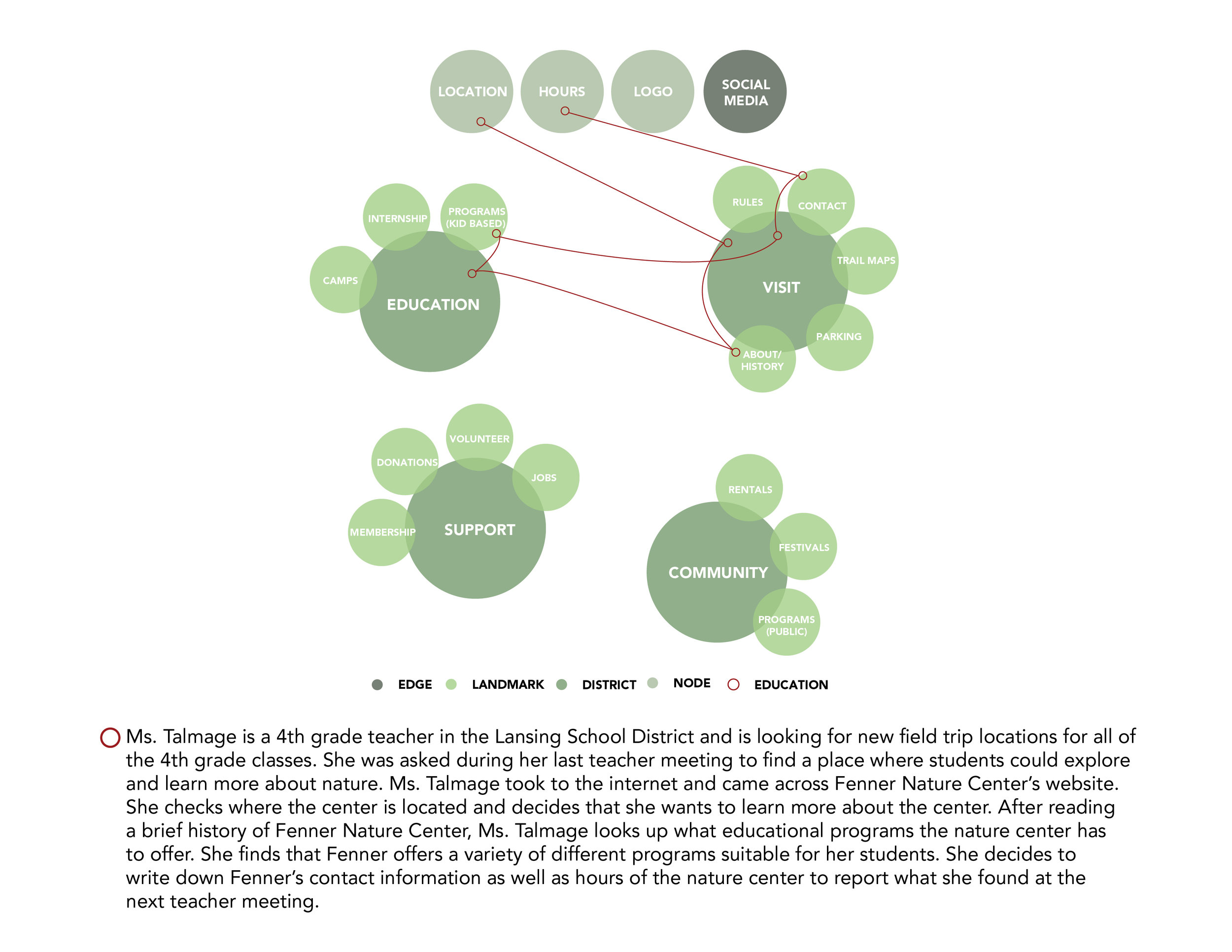
Lynch Map and User Scenario
After identifying the potential individuals that would come to the center, a user scenario was created to show their path through the website.
Wireframes
Then wireframes, basic design, were created to visualize the user path and show the hierarchy of information that was most relevant the user.
Digital Wireframe
After creating a wireframe, the next step was to create a digital mockup (digital wireframe) of the user scenario. This help visualize what the website could look like before applying the finalized style guide.
Style Guide
Since this project was a redesign and not a re-branding, I had to use the colors and type that Fenner Nature Center already had in place. So, for my style guide I added more colors that complemented the existing colors. I also switched up how the fonts were being used for headers and body copy.
Visual Design Compositions
After a style guide was finalized, I started to create a visual design that integrated all the information, colors, and styles that would work best for Fenner Nature Center.
Final Design
I was inspired by the programs and activities that Fenner Nature Center had to offer and I wanted to keep the design simple but still capture the essence of nature. So, I used images in the background that reflect the beauty of the nature center as well as muted neutral colors to create a calming environment.
Images provided from unsplash.com


